
It is a text-only Bible. There are no book introductions, no study notes, no cross references, no concordances, no maps, no reading plans. This isn't that kind of Bible. Do I miss the extras when they are not there? Not really. Sure, I wish for short one or two page book introductions now and then. (Some books I "need" a little extra help placing in context.) But for the most part, text-only suits me just fine. In fact, I read text-only Bibles more often than not. By choice. Sometimes less is more. Sometimes that stuff is just a distraction.
It is single column. Each page has wide margins--lined margins--creating a square of Bible text. It is an oddly comforting shape. One I didn't expect to be drawn to. But I am.
The font size of the text is on the small side, I won't lie. The good news? I seem to be in the minority in preferred font size. My eyes enjoy a good 9 to 10 point font. The rest of the world? Well, they seem to be moving more and more towards a 7 to 8 point font. (This year alone, I've specialized in ordering large-to-giant-to-super-giant editions of the Bible in my favorite translations. The largest font size I've got is 18 point.)
The weight of the book is great. Because it is on the light side, one can easily read it in bed or sitting in a chair. One can easily carry it back and forth. There's a delicate balance between weight and font-size that must be achieved if a Bible is to be 'for me.' Too heavy, and it's not practical. Font impossibly small, it's not practical. (That's why study Bibles are becoming increasingly impossible for me to use--no matter how much I wish it was otherwise.) Because it is light enough to hold as close as I need to see, I can still manage this one.
Laying flat. It is ESSENTIAL in my opinion for a Bible to actually lay flat. So many Bibles have impossible margins where you lose the last word or two of text on each line. The NIV Journal the Word Bible is excellent at laying flat.
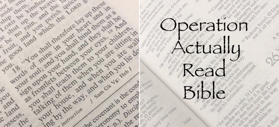
Black letter. I really love that this edition of the NIV Bible is black letter. The words of Christ are not in red in this particular Bible. I much prefer black letter Bibles to red letter Bibles. I do like that readers have choices. It is possible to get black letter or red letter in most translations. (With a few exceptions. I've spent YEARS of my life searching for NASB bibles that were both black letter and in paragraph format.)
Paragraph format. Poetry is still poetry, of course. But the prose sections are in paragraph format instead of verse, verse, verse.
Thickness of the paper. It is not as perfectly thick as it would be in my dream Bible. That being said, the pages are slightly thicker than what is being used in most Bibles. I think with each passing year, Bible pages are getting thinner and thinner. And it's becoming more and more difficult to read one page at a time. There is some bleed-through on this one. Not horrible or awful. But some. (One Bible I received recently--I won't name names--you could see about five or six pages of Bible text bleeding through. It makes me think: do publishers not understand that the Bible is for reading, and reading comfortably?)
Conclusion: I do think this Bible was put together with care and with readers in mind. I have not tried journaling in it--at least not yet--because I'm not sure what pens or pencils would be safe to use. If you have recommendations, I'd love to hear them!
© Becky Laney of Operation Actually Read Bible
No comments:
Post a Comment